Self-checkout System
Selfee is a project for redesigning interfaces of the self-checkout system. Through Selfee, shoppers can have hassle-free checkout experiences because it provides shoppers a better experience by following the clear instructional interfaces, selecting multiple choices to scan items, and using a simple route to make payments.
Team
5 people
Role
Team leader
My responsibilities
Research planning, business canvas summary, questionnaire design, potential user interviews, prototypes design, work report
Problem
Current self-checkout systems are inconvenient, slow and outdated, often requiring customers to seek assistance from store staff. The aim of our concept is to create a faster checkout process, eliminate queues, improve customer privacy, reduce labor costs and ultimately improve the customer experience.


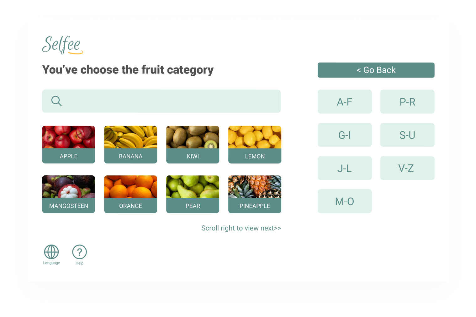

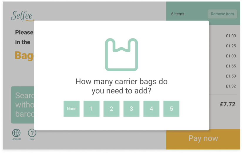


Selfee is a re-designed system that encourages a hassle-free check-out experience. Shoppers can process their orders by following clear instructional interfaces, such as newbie's guidelines, multiple choices to scan items, and a simple route to make payment.
High-fidelity prototypes were designed on Figma to make products with interactive effects. Try it!
Timeline
I built the timeline to illlustrate the overall process of the case study, from the beginning discovering stage to the final usability testing, which includes both qualitative and quantitative research in terms of purposes and requirements.

Discover
Literature Review
The search string for previous evidence used the PICO method, which helped identify the topic's population, Intervention, comparison, and outcome concepts.

Business Model Canvas
The business model is targeted at improving the customer shopping experience via self-checkout systems. It has 12 parts to consider self-checkout systems from businesses perspectives.

Define
Questionnaire
The survey investigated the key factors that will influence customers’ shopping experience at checkout. By summarising 10 questions in 3 parts, from simplistic to more profound questions, the purpose was to get quantitative results.

Insights
The top 5 retail stores that shoppers frequently visit are Sainsbury’s, Tesco, M&S, Iceland, and Waitrose.
Almost half of the customers prefer using self-checkout systems.
78% of shoppers had requested assistance when using self-checkout machines.
Suggestions for improvement are explicit instruction, larger placing area, accept various payments, the ability to switch to another language, etc.
Semi-structured Interview
In order to learn about specific problems encountered by customers while using self-checkout systems in supermarkets, the interview proceeded from both facets of shopping habits and shopping issues.
In conclusion, 5 Participants often encountered following problems during shopping. They often needed external help, with one customer also mentioning feelings of anxiety when waiting for help.

Painpoints
Customer difficulties can be found from 50 responses to the questionnaire and more detailed responses from 5 participants of the semi-structured interview.

Competitive Analysis
From the latest studies, it can be known that there are new shopping technologies consistently emerging. Moreover, through feedback from questionnaires and interviews, mainstream checkout user flows from popular brands in London can be compared.

User Flow
According to previous research of mainstream self-checkout interfaces, most self-checkout systems in these markets followed the flow pattern below.

Design
After summarising the user flow and the task flow, low-fi prototypes were designed, and high-fi prototypes were improved based on the results from usability testing.
Low-fidelity Prototypes

Qualitative Usability Testing
In order to clearly and effectively elaborate our lo-fi prototypes, our team conducted a usability test plan, which described the concrete steps taken during the process.
Task example
Mission 3 of 5
Objective: Weight the item & add it to the cart

High-fidelity Prototypes

Test
High-fidelity prototypes of the self-checkout system are the closest in resemblance to the final design in terms of details and functionality, allowing our team to examine the usability questions raised by the low-fi prototypes thoroughly.
Quantitative Usability Testing
Before
The misclick rate of the task “Remove an item” was 25%.
Failure Analysis
Observing results reveals that the user can locate the two buttons that must be clicked, respectively [Remove item] and [Sweet Potato]. However, there is uncertainty in the order of clicking the buttons, because users can not see any changes after removing operations, and we realized it should display more visibility of the system’s status.
After
After adding the disabled state by clicking the button “Remove item”, the test results showed that task [Remove an item] in test 1 had been optimised. The click-through rate of the remove item operation has been increased to 100%. The user can complete removing the item in a short time, with the average time being 4.1s.
